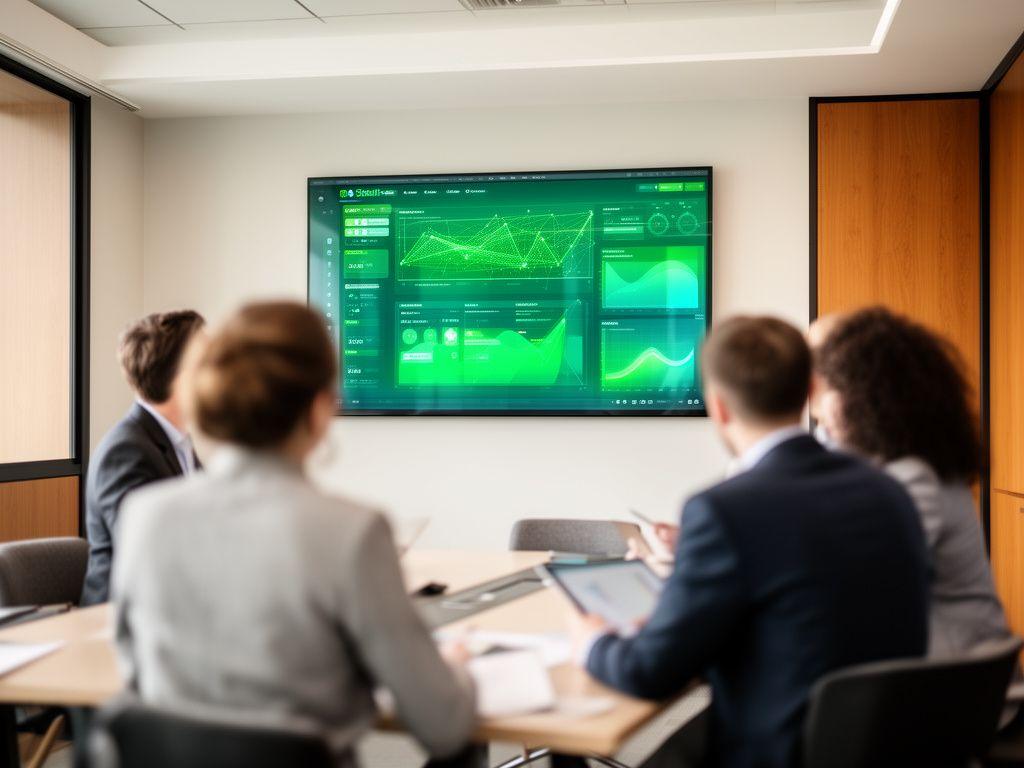
Case studies that show what SageSight AI can really change.
Need a clearer picture before you commit? These projects show how our AI-powered dashboards have shortened reporting cycles, sharpened forecasting, and helped teams act with less guesswork.
We build for busy operators, finance teams, and leadership groups who don't have time for guesswork. The result is simple: cleaner decisions, faster meetings, and dashboards people actually use.
Dashboard success stories
What happens when reporting stops dragging its feet?
One featured implementation, then two focused examples beneath it. Clean. Easy to scan. Built for decision-makers.
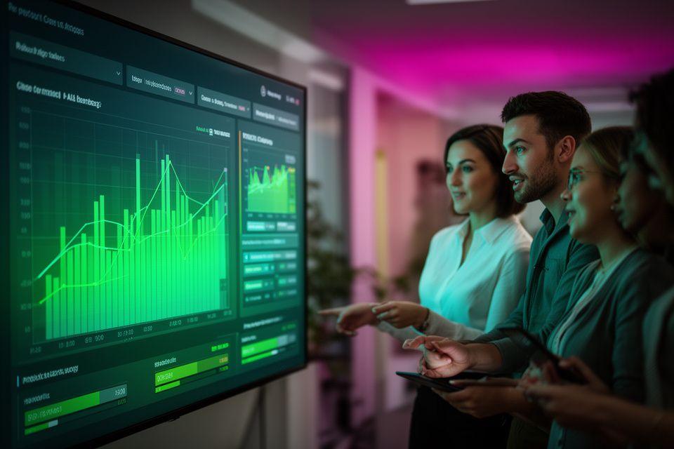
How a UK retailer cut reporting time by 70%
Their weekly trade pack used to take most of Monday. Nobody enjoyed it. We replaced the manual spreadsheet chase with a live performance dashboard that pulled in sales, stock, and margin data automatically.
The leadership team now opens one screen and gets the full picture. Why wait hours for a pack when the answer is already there?
- 70% faster reporting cycles
- One source of truth for trading, stock, and margin
- Fewer manual errors before board review
Predictive maintenance for a manufacturer
Machines were being fixed after problems appeared. That changed.
We introduced an AI maintenance dashboard that highlighted temperature drift, vibration trends, and service patterns before downtime hit production. Could the team spot failures earlier? They could, and they did.
Sales forecasting for a services firm
Pipeline visibility improved without adding noise.
The dashboard brought together opportunity stages, historic close rates, and booking velocity so the commercial team could see what was likely to land. No more arguing over three different spreadsheets.
Measurable impact
The numbers tell the story, don't they?
We focus on outcomes that matter to management, not vanity charts.
Faster reporting cycles
Teams moved from manual pack-building to live dashboard review, which means meetings start with answers rather than admin.
Improvement in forecast accuracy
Better data blending and trend visibility gave commercial teams more reliable month-end and quarter-end expectations.
Hours saved weekly
Manual report prep dropped away, freeing analysts to investigate trends instead of stitching together exports.
Want your own numbers to look like this?
We can map the data sources, define the metrics that matter, and build the dashboard around your actual workflow. That way, adoption happens naturally, not by force.
Quick read
Built for leadership reviews
Designed for operational teams
Focused on measurable ROI
Client voices
What do clients say once the dashboard is live?
A compact carousel makes the feedback easy to scan on mobile. No fuss.
Next step
Ready to see a case study built around your data?
We'll talk through your reporting pain points, the systems you already use, and the decision points that keep slowing your team down. Then we'll show you how a dashboard could remove the friction.
Email us
Call us
+447933683770
Visit us
10 Rounds Green Road, Sandwell, B69 2BU, UK